
Sawmills Studio
Sawmills Studio is a community arts space run by a collective of artists, designers and typographers who have workshops in the community and educational bodies. They are committed to promoting and showcasing the power of typography.
After discovering five Victorian letterpress machines they have began the journey to re-establishing themselves as a working press and museum. They see the development as a chance at creating a centre of excellence for typography in Ireland. Sawmills Studio aims to conserve, develop and protect the art form of letterpress printing while showcasing the social history of print in Kells, County Meath.
Sawmills Studio also hold a typography festival each year in the town called ‘TypeTrail’. To view the TypeTrail rebrand follow the link.
Objective
Create a visual communication identity, branding and strategy for Sawmills Studio that empathises with and connects with their target audiences while reflecting their ethos.
Shareholders
Tourists
Educational
General Public
Creatives
Design Areas
Branding
Graphic Design
User Experience
User Interface
Social Media
Print
Leaflet
Shareholder - General Public and Tourists
Research Methods
Double Diamond
Interviews
Surveys
Personas
Secondary Research
Audience Lifecycle


Exhibition Tickets and Space


Business Card

Children’s activity
The activity is based on children using letters to create animals as seen below.


Staff Uniforms/Apron for children’s workshops


Digital Elements
First Wireframe Sketches


prototype for web and mobile
Shows animation of various elements to tie the brand together.


Stickers - instant branding


membership cards


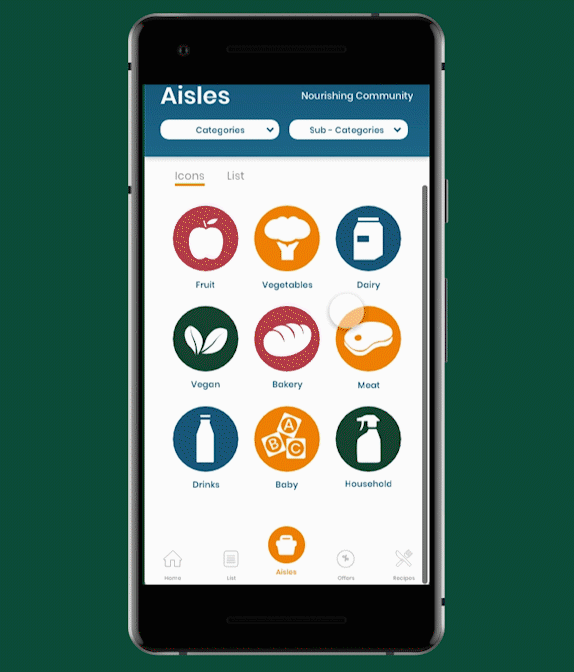
Dublin Food Co-op
About the project
Dublin Food Co-op is an ethical food store based in Dublin city centre which embraces community and sustainable living. The Co-op is an organisation formed by a mutual passion for the environment and organic produce. In the age of the conscious consumer Dublin Food Co-op promotes the rational use of the Earth’s resources while supplying organic whole foods to their customers. The Co-op is much more than a shopping experience it is a community with easy access to healthy, fresh produce. Customers can support local, small scale agriculture while being socially responsible and keeping their environmental footprint in mind.
The Co-op goes beyond food organising workshops, talks and events to raise its cultural profile.
Objective
The main objective is to modernise the Dublin Food Co-op’s image whilst keeping their traditional roots and ethos intact. To understand the history of the Co-op and its morals we will produce a brand identity aimed at deepening their current member base but also enticing more health conscious, forward thinking consumers to the Co-op. and to introduce more customers to support the local Co-op and help to sustain our environment while expanding this vibrant community of like-minded thinkers.
RESEARCH METHODS
Double Diamond
Interviews
Surveys
Personas
Secondary Research
Shareholders
Consumers
Co-op Members
Local Suppliers
Design Areas
Branding
Graphic Design
Print
User Experience
User Interaction
Social Media
Slogan
“Nourishing Community” and “Deep Rooted Since 1983”
These slogans were developed as part of the branding.
WIcked Problem
“Define the problem, design the solution.”
Brands help consumers make choices. It appeals to the senses, a good brand makes us want to see it, touch it, hold it and watch it. Dublin Food Co-op are at a turning point in their business, they are planning on moving premises and are trying to find a niche in the supermarket industry in Dublin. This project was deemed a wicked problem since the client were not certain of what they wanted but knew they wanted change and a refresh to give them an edge amongst larger supermarket brands.
The solution to this problem was creating a brand positioning statement with a defined mission and vision for Dublin Food Co-ops brand while also identifying who it would attract.
Client Interview
At the initial client meeting questions were asked to try and answer some of the wicked problems at hand. Some themes emerged and documenting them visually is always helpful to give instant insight into the problem and the solution.
This quick infographic shows the interconnectedness between all aspects of the Dublin Food Co-op. This methods shows that they want to be connected to people, to the earth and to their food in the age of the conscious consumer.
Shopping at the Co-op is more than just a shopping experience it’s a community and offers an alternative to common profit-orientated business models.
Surveys and Interviews
According to social proof studies many questions which involve ethics do not get accurate results because people feel pressured to give the morally correct answer. Since many questions that were being put to potiental customers were on the topic of environmental consciousness the survey stayed anonymous so we could gather accurate insights.
Areas Identified are:
Healthy Eating is important to a majority of people surveyed.
Most had not heard of Dublin Food Co-op.
Majority would pay more for ethically sourced goods and produce.
People have busy lives and are often unable to get healthy food as often as they would like.
Co-op Shopper Interviews
Areas Identified are:
Many are not members.
Majority vegan or vegetarian.
Age bracket 25 - 35.
Mostly female.
Buzzwords about the store - wholesome, spacious, multicultural, friendly.
Main target customer identified from research is female between 25-35 with disposable income and interested in a healthy lifestyle.
Lifecycle Mapping
The main areas of the customer lifecycle within the brand will be various touch-points throughout the store and online. The previous brand was uninviting and did not look professional, a revitalised brand will draw new customers which connect with sleek, clean, organic visuals.
Many people surveyed also said they would like to have healthy food conveniently since they have busy lives. Having an app or a website where the customer can place an order for delivery or collect will help the co-op tackle competition from rivals within Dublin City. Their events and activities can also be marketed on the app which will encourage engagement and experience amongst customers.
Visual Language Development
Visiting the store was the main starting point of development. The team wanted to create a logo that represented each aspect of the Co-ops values in a professional but organic and playful way.
Colour and texture inspiration from fruit and vegetables in store went on to influence the logo and other various areas of the projects visual brand. Much of the logo was also determined by four areas identified as the co-ops main brand pillars.
Connecting with people.
Focusing on the local community.
Supporting suppliers and their members.
The activist roots the co-op was founded upon.


These are only some stages of the design process. Please visit the dedicated process page for more information on other processes.
Deliverables
Logo
In-store Branding
Posters

Grocery App Prototype


Postgraduate Research
Result - First Class Honours
Accessibility and Universal Design with Signage and Technology.
The relationship between our eyes and our anatomy is an important one that is taken for granted by the urban environments we inhabit. Having access to those urban environments is of vital importance, especially to those with visual disabilities. How can our urban environments adapt to use other cognitive and sensorial means to support those with visual deficits?
My postgraduate research was inspired by an article called ‘Font Memories of Dublin Past’ featured in ‘The Times’. The article speaks of the concerns around Dublin’s street nameplate signage giving opinions of various councilors and experts. While much of the article is focused on the aesthetic of the signs a short paragraph highlighting the accessibility of the signs surrounding blind and visually impaired people is what struck my interest.
This is a large body of work, the page will highlight some main pieces of valuable information discovered throughout the research. If you would like to read the full paper please get in contact.

Examples of nameplate signs seen throughout Dublin City.


Design Theory and Accessibility

More people over the age of 65 are experiencing sight loss. Since there is a connection between Irelands ageing population and visual impairments we need to consider how to provide optimal support for those individuals not just through health services but through modern social and environmental outlets to allow them to keep their independence for as long as possible.
In order to fully understand the needs of visually impaired and blind people examining the design theories surrounding ethical and human-centric design is essential.
Universal Design
Accessibility Design
User Experience Design
Graphic Design
Colour Theory
Typography
Interaction Design
Environmental Graphic Design
Law and Restrictions to Design
Requirements for Accessibility and Disability
Human- Centric/Accessible Technology
Barrier-Free Best Practice
Visual Impairments, Blindness and Ageing
As humans, we can rely on different sensorial channels to experience the world. The world and culture revolve around visual dominance including design, text, television, computers, signage and more. The visual format in which we acquire information through these means plays a significant role in our daily lives. Increased visual demands of our modern culture will increase the impact of low vision and blindness on our society in the coming decades.

Policies and Law


There are many official local government and government policies to consider when looking at the area of street nameplates. There are responsibilities and code of practice highlighting the obligation of the state to acknowledge the cultural heritage and identity associated with the Irish language. The Official Languages Act is a strong declaration of this and is a constant reminder of the primary status of the Irish language claiming Ireland as a bilingual state.
This means Irish always has to come first on state documents and signage such as the street nameplate signage.
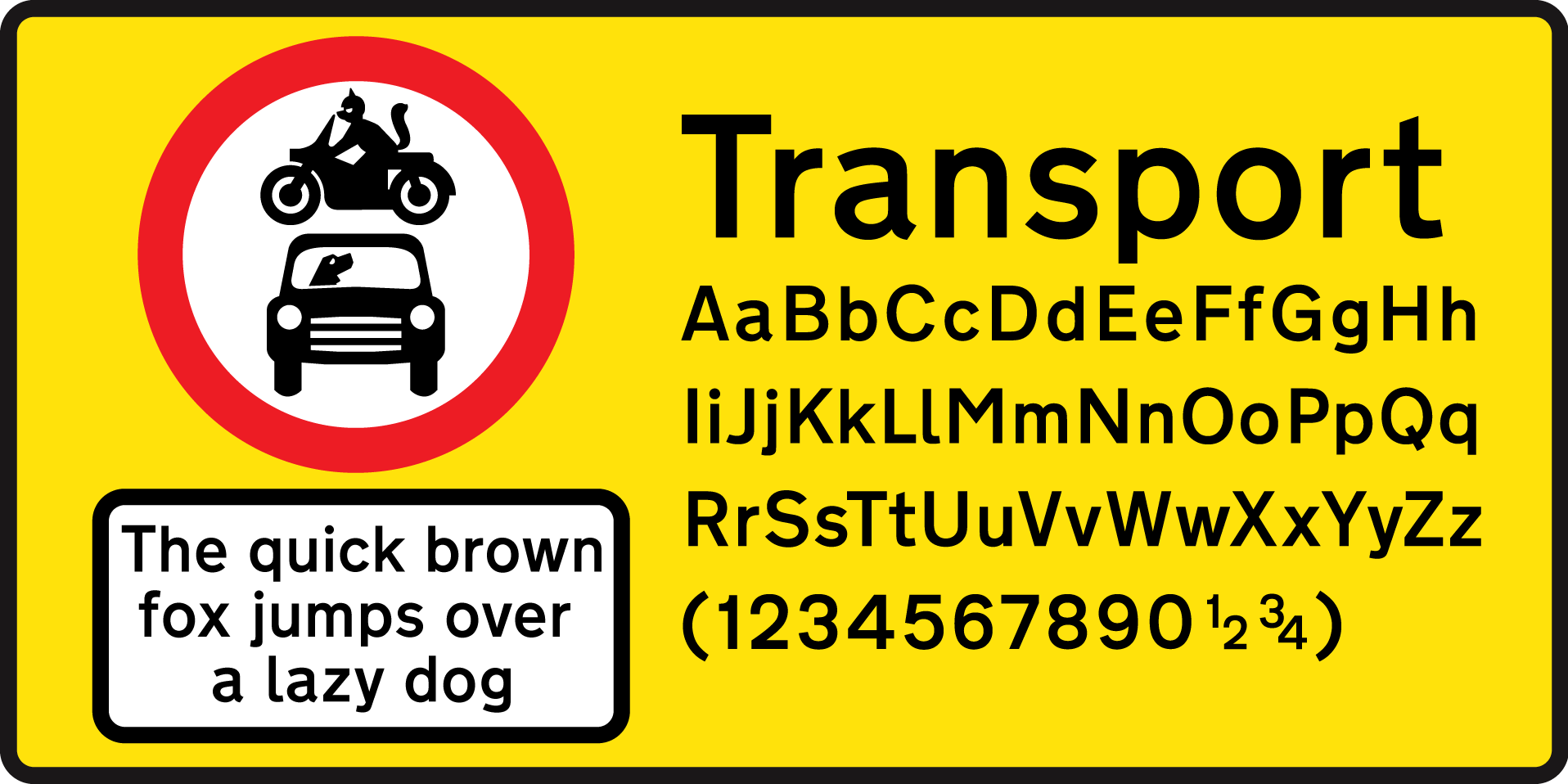
Transport Typeface
Typeface choice is critical to a successful project outcome it determines the legibility of the signage both for visual and tactile elements. Current guidelines suggest that English and Irish on the street nameplates in Dublin city should be uppercase “Transport Medium” while also condensing the typeface to 62%. The sign must provide the same information in both languages and therefore lettering style, colour and text should be the same for both the Irish and English text. Research has shown that the modern street nameplate signs are modelled off motorway signs in the UK and Ireland. Many experts believe the Irish is devalued through the use of ‘Transport’ since it was not designed for use as Gaeilge and often has to be adapted for Irish words.

Argument for Celtic Rendition of Irish
As you can see there is a clear argument for and against Celtic or traditional typefaces for the Irish language on street nameplate signage. Irish in this form and the 2003 Language Act creates the possibility of conflict with best practice for visually impaired and blind people.


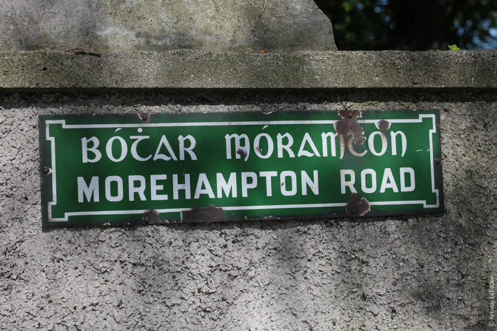
Various ways a Celtic typeface is executed on signage.
Dublin Public Realm Policies and Strategies


These policies define universal design “as a standard for planning and design” in the city and want to put the needs of the people “at the heart of the work”. Dublin City Council claim they “the principles of Universal Design have been placed at the core of this strategy”.
Dublin City Council goes on to declare their main priority is “improved quality of life” within the strategy. They say the public realm is; Free to use, it is experienced as a whole by the everyday user regardless of age or capability. It is an essential part of everyday life and has a significant impact on how we interact with and enjoy the city.
They stress the importance of a city that is “safe and easy to navigate” and believe “Dublin’s identity is inseparable from the user’s experience of the city”. Enticing people to walk emphasising “the need to develop a high-quality network of active, attractive and safe streets and public places which are memorable and encourage walking”. They also state that they “will seek to provide a safe and pleasant walking experience for all”.
This information is important since designers must place pedestrians at the top of the user hierarchy within the ‘The Design Manual for Urban Roads and Streets’ published by the Department of Transport, Tourism and Sport. Having county council recognise the need for universal design is a step forward. Having authorities create real action around various universal design issues is important.
Visual Impairments, Blindness, Ageing and Design Theory in Practice
Solutions need to be sought in various areas in cities which are not just “politically correct” but also serve the purpose of making everyday life easier for people. The challenge of facing the requirements of tomorrow increases and should be solved through intelligent planning. It has become more critical than before since our environments have grown more complex and confusing. Finding our way through towns and cities was once a minor task that has now developed into a challenge. Understanding the function of information and effectively designing that information is essential.
Providing information for problem-solving is a key task for designers. In our urban environments, wayfinding and signage is a problem-solving activity. Gaining an understanding of how sighted people and people with visual impairments inhabit those environments and solve those problems help determine what information is needed and where.
Technology
Many smartphones have inbuilt technology which allows them to hear menus and applications on their phones. This video is an example of how the iPhone works using voice feedback. In my primary research I witnessed blind users interact with their smartphones and use technological aids. This will be discussed more in the primary research section.
Seeing AI - Microsoft


‘Seeing AI’ is a Microsoft phone app designed with input from 12 visually impaired Microsoft employees. Microsoft wants to empower people with their phones. Microsoft describes the app as using “computer vision to audibly help blind and visually impaired people to see the world around them”.
Microsoft says this app can read short text, documents, help locate and identify barcodes on products, recognise faces and currency. The app has various channels the user goes through to allow the device to understand what it is reading. A new feature Microsoft is experimenting with is “Scene”, this will describe the environment the user is situated in directly through their phone. Microsoft says Seeing AI “turns the visual world into an audible experience”. Seeing AI is currently free and exclusively available on the Apple app store.
Aira
Another form of technology is called ‘Aira’, this is a smart glass device that the user wears like regular glasses. It also has a built-in headset on the side. Aira like Microsoft’s Seeing AI works off the user’s mobile phone except it relies on the use of the headset and connecting with remote call centre agents that work at Aira headquarters. The app sends images from the user’s headpiece to the agent, the agent then describes or provides instruction to the user. Aira claims that the user gets immediate access to a call centre agent.


Google Look OuT
‘Google Look Out’ is again another app currently in development that claims blind and visually impaired users will gain independence through their smartphone. To use ‘Look Out’ a smartphone device is worn around the user’s neck. Google claims it can read signs such as exit signs, it also gives users auditory clues to the items, text and people around them. The app has different modes to allow the device to understand what kind of environment the user is in similar to Microsoft’s Seeing AI. Like Seeing AI, Look Out also is orientated around using the smartphone camera lens but on android phones.

Walk Dublin

Dublin centric application ‘Walk Dublin’ launched in 2012 for iPhone. It was developed with NCBI and with blind and visually impaired people in mind giving them audio to follow when navigating the city. The “Walk Dublin” app was launched to complement the new wayfinding systems installed throughout Dublin inner city in 2011 and 2012. Mayor of Dublin City at the time Naoise Ó Muirí commented at the launch stating "The function of the wayfinding app is to assist people in successfully navigating their way around the city and to obtain information about the key cultural and institutional attractions in the city". As per September 23rd 2018 this app is unavailable to download and is not featured on iTunes or Apple app store.
Insights
Technology relies on internet connection, this depends on mobile connectivity through 4G and the strength of WIFI internet. This technology will carry on developing rapidly given the decreasing costs of sensors, smartphone, cameras and camera smartphones together.
Research conducted in Chicago gives an insight into older peoples use of technology regarding navigation compared to street signage. “Older Adult Strategies for Wayfinding” research states out of 35 participants over the age of 65 only 2 used GPS or their mobile phone for directions, 80% of participants in the study favoured street nameplates while 8.2% found advance (signs that say the upcoming street) helpful.
Googles Director of Accessibility Eve Anderson comments on this saying “most of us are likely to discover that accessible technology will become more important to us as we age” so digital literacy could be generational.
Best Practice for Barrier-Free Signage


Wayfinding is a series of decisions that need to be supported by effective signs. These decisions have also been helped by tactile, Braille and audio advances to assist a wider range of people. A successful sign should minimise such anxiety and confusion. It should be easy to understand and people with visual impairment should not be placed at a disadvantage. Signs should be “clear, concise and consistent” to be barrier-free and also feature visual, embossed, Braille and audible elements.
Through research many designers stated typographic requests from clients or architects more often than not they will require uppercase letters in their plans. Designers state that they view the “capital letters as somehow sturdier or safer” compared to a mix of upper case and lower case letters on signage.
Regarding designing for maximum legibility using lower case letters is also essential. They produce a word shape which is important in signage especially where environmental factors come into play. Improved legibility will be achieved if the first word of each of the keywords begins with a capital letter; subsequent words should begin with a lower case letter. Typeface choice is critical to a successful project outcome it determines the legibility of the signage both for visual and tactile elements. Avoidance of exaggerated typefaces that are decorative since they will take from the readability, using limited typefaces and type sizes on a sign is also recommended. A sans serif typeface is favoured.
According to type size, this should be thought of when looking at the user’s distance from the sign whether they are long distance reading, medium reading or close-up reading. The arrangement of typography is also essential, considering the line spacing is consistent, the layout is effective and the range of text. Barker also suggests that people with visual impairments also require a 15 – 20% increase in line spacing.
Typographically along with the use of sans-serif typefaces and the mix of upper and lower-case letters supplementary information should include tactile and Braille elements. Sans-serif typefaces allow the user to clearly define each character through its rounded shape and edge
Regarding tactile signage, it must allow the user to come in contact with the sign and touch the text with no difficulty. Placing tactile signs within close range of the user should be an important consideration. Signs should be placed on the wall low enough so that a person in a wheelchair can reach the text and Braille that is incorporated into the signage in a consistent manner.
Contemplating typography, colour and placement about universal planning of signage and highlighting best practice from experts is important while gaining insights on how Braille and tactile elements can work best. This adds context when observing the signs at the moment and how they can be improved if at all. Showing that even slight changes can drastically increase legibility and create a more inclusive urban environment for visually impaired people. Sustaining each other is vital in modern society and has become an issue we are being faced with more often as we consider people with disabilities and look towards how to keep people in society independent as they age.

Welsh Road Sign with a mix of Upper and Lower case letters

Dublin Street Nameplate Signs as per 2018 using all Uppercase letters.

Examples of Word Recognition and Legibility from using word shapes
Interviews and Insights from Primary Research
Participants were selected as they have direct knowledge of the research topic or are experts in their fields. A diverse range of participants was chosen to offer various views and perspectives on the research topic. This information will fill in the gaps found in the secondary research while also giving a voice to the first hand experiences of people with blindness and visual impairments. The names of the people interviewed are removed to protect their identity since this website is a public platform. Individuals that were interviewed discussed the same topics allowing them to give a variety of perspectives.
Purpose of Interviews
The purpose of the interviews is to gain a first-hand expert opinion on systems in place at the moment surrounding blindness and visual impairments, plans for future accommodation for blind and visual impaired people to do with signage given the Public Realm masterplans stance on universal design and ageing. Identify and understand the unique perspectives of blind and visually impaired people in Ireland regarding wayfinding and signage which would not be available through published works. Building on information gathered throughout the secondary research and closing gaps which may have emerged throughout about this research topic.
Main Insights
Interviewee A
Believes more prototyping and conversations directly with users with a disability need to occur when shaping the urban environment.
Thinks many accessibility standards are often for wheelchair users and not so much for blind and visually impaired people.
Thinks technology is the way forward for blind people. She does not know braille since tech solutions have helped her.
Says tech solutions are not reliable although they are getting better yearly.
Signs are up high on buildings from what she can remember. Says she wouldn’t be able to touch them.
Confused when voting. Irish came before English on the paper.
Interviewee B
Believes most people plan for the most able in society. Plan for the least able and they’re not leaving anyone out. Everyone else needs are catered for automatically.
Thinks avoidance of accessibility design comes down to “a culture that avoids rules and regulations”.
Main issue behind the absence of universal design attitudes in Ireland is
lack of long-term vision.
Empathy issue with users. Many can’t place themselves in others shoes.
Engineered solution needs to be balanced by a multidisciplinary team of professionals including a knowledgeable designer.
The engineering solutions have predominated our urban environment, but
it doesn't mean it’s always the best.
No consistency with signs at the moment.
Interviewee C
Compromise a big issue within universal design in Council. Accessibility group advocates require various things which sometimes conflict with each other.
Irish Language Act will always trump universal design since it is in law. Universal design is not enacted in law.
Universal design is location specific meaning they look for the greatest outcome per area.
Thinks multi-disciplinary teams are required but difficulties arise from gaining perspectives from many disciplines.
Says Public Realm group was created to advocate for the softer needs and the people friendly things that are required to make things work that are forgotten sometimes through engineered thinking.
Many government bodies don't have much of an appreciation of good design.
Universal design and barrier-free design solutions are leaning towards a technological solution.
Believes technology still is the best solution stating as the population ages technology literacy expand.
Interviewee D
NCBI are direct consulates with the Council.
Believes people’s attitudes towards accessible design is changing slowly.
Many companies do not have awareness training with accessibility.
Thinks technology is not developing at a fast rate surrounding this issue.
Buildings aren’t obliged to have the street signage on them. States it should be a planning requirement.
No consistency with the signs are the moment, typography especially not helpful for visually impaired people.
Signs should think of proximity to the ground and to the turning point, and how regular they are on long streets. Decision points especially.
Interviewee E
Graphic designer and user experience design on internal teams researching and empathising with disability groups in the City of Sydney.
Designers played a pivotal role in developing the project.
Collaborated with the vision impaired stakeholder groups determining the font type and font size through user research and testing.
The stakeholder groups provided further input on materiality and finishes during the prototyping and piloting phase.
Sydney used uppercase and lower case letters on signage as it conforms with best practice and legibility.
Interviewee F
Apprehensive about the limits technology has at the moment. Believes they can’t rely on technology entirely but thinks reliability is getting better.
Says it will be a number of years before technology will be developed
enough to create a reliable user experience for blind and visually impaired people.
Phones only read out so many things.
A lot of elderly people aren’t good at technology at the moment. They need help with digital literacy.
States there should be more awareness around what’s available technology wise and to give those without strong literacy a helping hand.
Finding the sign at an acceptable height for them would be an issue. They believe they would panic from searching walls.
Confusion when voting due to Irish coming before English on the paper.
Analysis of the primary data has shown some themes and common connections between participants and expert opinion in the literature. Participants gave varied opinions on the subject matter which contributed to gathered secondary data previously collected. It gave a unique insight into the handling of nameplate design in Dublin. The interviewees offered awareness of many factors which determine how best practice is achievable including the conflict between policy and inclusive design. There is some reference to this in the secondary research but gaining perspective from experts who work with these limitations in Ireland and abroad was essential in building understanding as to how opposing factors occur.
Conclusions and Recommendations
This segment makes recommendations regarding the conclusions raised. These points demonstrate that there are some conflicting issues regarding best practice. Through the identification of these differences, a variety of crucial considerations emerged when addressing best practice and the needs of the user.

Currently editing this page. Please hold tight.

How Digital Design Can Help Dyslexics Move to Screen
An analysis of the struggles dyslexics face online and how through effective design the issues they face can be minimised.
This research critically examines the changes that designers can make with user experience design, graphics, layout and navigation, that can help people with dyslexia online using Moodle as an example.
Result - First Class Honours
Designers have an important role to play in communicating to the world. How messages are expressed, portrayed and received is equally as important. Designers have a huge responsibility to showcase information in the clearest way possible for the audience to understand.

Within the field of visual communications web design has recently come to the forefront. Web and digital design is the process of creating websites; it combines several elements together including webpage layout, user experience design, interface design, content and graphic design. At the end of 2014 an estimated 3 billion users globally will have access to the Internet. As more people move from paper to the Internet, user experience and user interface design has become a more planned practice helping people gain more from their on-line experience.
Making a Difference
Visual issues affect more than just the visually impaired; designers need more consideration for people with disabilities like dyslexia. Online accessibility increases the quality of peoples lives greatly that suffer from dyslexia and other visual difficulties giving them a sense of freedom and confidence. Design needs to be more socially responsible and to consider more than just the average person. People with dyslexia have a unique challenge; that designers are problem solvers and should produce designs that help solve the issues that people face.
Web design is usually aimed at the average, visually able person, but what about those people who do not fit into that category? This raises the issue of social responsibility within web design. When planning a web page, designers fail to consider the startling number of people with some form of dyslexia. Such people with dyslexia have to contend with many issues related to their dyslexia on a daily basis; performing tasks online shouldn’t be an added concern if it can be helped.
What is Dyslexia?
Dyslexia symptoms vary from person to person but there are common links between all. The Dyslexia Association of Ireland defines dyslexia as ‘specific learning difficulty affecting the acquisition of fluent and accurate reading and spelling skills’. This occurs despite access to appropriate learning opportunities. The most common of all symptoms are reading difficulties. Spelling and speech are also a struggle whilst distinguishing between sounds can also prove to be a challenge. These symptoms mentioned barely scan over the problems people with the condition endure on a regular basis such as using forms, reading street signs, to viewing a bank statement. The Internet can be harnessed in such a way to help those with dyslexia.
Dyslexia is a learning difficulty that primarily affects the skills involved in word recognition and spelling. It is a cognitive neurobiological condition that is located physically in the brain and affects the development of a person's individual's literacy skills.These struggles appear even when the person is a smart, capable individual and seems to have a good oral understanding of what they are trying to say, spell or read.
There are a number of main characteristic difficulties associated with dyslexia such as phonological (the study of speech sounds in a language), visual difficulties and auditory processing. Dyslexia is a phonological impairment which means dyslexics find it hard to associate sounds with letters in turn, affecting their reading and writing. When understanding and speaking a language the normal brain automatically converts the word into phonemes (smallest unit of a word) for the person to say it. They then try to read or write a word, the person needs to identify the letters associated with the phonemes and arrange them into a word. This is called phonological processing, people with dyslexia struggle to achieve this from an early age. Issues resulting from phonological processing have been found in at least 80 to 90 % of individuals with dyslexia. There is no relationship between a person’s intellect, individual effort or social position and the presence of dyslexia. It is not a sign of poor vision or laziness. People who have dyslexia cannot outgrow it. It is a lifelong condition, it is genetic and it does not go away.
Biological

Dyslexia is regarded as a neurobiological condition, which stems from genetics. Individuals can inherit dyslexia from a parent, if one parent has dyslexia there is a 40% to 60% chance of the child inheriting dyslexia. This affects the performance of the neurological system that is the part of the brain used for learning to read. Essentially this means the brain’s construction and the neural connections that are needed for processing information has developed differently in those who are dyslexic. This connection means they find processing tasks involving reading and language more challenging than those without dyslexia. People with dyslexia have a visual, right brained processing style and think largely in image.

People with dyslexia also attempt to spell words phonetically, such as “pleez” for “please” or “dus” for “does”. Other sufferers also have problems with jumbled spellings, which means they get the letters correct, but not in the right order such as “firend” for “friend” showing they have visual memory issues. Dyslexics sometimes confuse the letters with being upside down or backwards for example instead of reading, “dog” they read ”god”. Letters that look similar to each other are another source of confusion like “e” and “c” or letters, which appear similar but are opposites such as “b” and “d” or “p” and “q”.
Dyslexics have described words jumping around the page or appear layered on top of each other making it difficult to read. This can cause upset and headaches to the person trying to read the text.
ProGressing

More and more people with dyslexia are progressing to third level through increased awareness and resources. At Athlone Institute of Technology academic notes for class are put on a web based system called “Moodle”. Moodle is an open source-learning platform; used by millions of schools, universities, businesses and charities globally for eLearning.
Moodle helps educators build interactive online material, online courses, and collaborations as a resource for their students. However, the design and layout of Moodle itself is confusing and frustrating even for the most competent of readers. Those with and without dyslexia rely on Moodle to keep up with college work; it is necessary to create an easier online learning environment to enhance user and learning experience.
While creating the Moodle redesign the strengths people with dyslexia have will be highly incorporated and integrated into the website. Their weaknesses will be supported and explored through researched theory about all areas of user experience, web and graphic design through use of text, colour and imagery.
Design Theory with Dyslexia in Mind
Dyslexia and Typography

Difference between serif and sans serif typefaces
People often get mixed up with the terms ‘typeface’ and ‘font’. A typeface is the style or pattern of the letters. These are the parts that change thickness, roundness and how elaborate or curly the font looks. ‘Serifs’ and ‘sans serifs’ are the common classification or sometimes referred to as ‘with feet’ and ‘without feet’. Take the typeface ‘Times’ it has little ‘feet’ on the bottom of the letter ‘T’ as well as curls on the cross bar. In comparison a ‘sans serif’ font such as ‘Arial’ does not feature any of these. Font denotes the parameters applied to the typeface. This can make the typeface bold and italic, as well as size, and kerning (space between letters).

Arial Typeface
Recommended online fonts for dyslexics are Helvetica, Arial and Verdana. The Davis Dyslexia Association International has provided one example of online font research, as of November 2015 Arial and sans serif fonts were recommended for online readability.
Dyslexics find italicised text difficult to read. Compared to roman fonts, the letters appear to have a jagged line, with the letters also leaning to the right it’s difficult for dyslexic users to make out the text. A more logical way to highlight text is to use the bold feature; this makes the letters clearer and provides greater contrast. Font size is also a factor, while in the print world it is necessary to make the text as small as possible because of cost and the eco footprint of the document. However if the document is made for the sole purpose of the web there are no restrictions on the size of the font. The recommended sizes are 12pt or 14pt for readability.

Kerning
Kerning and ligatures should also be considered when using type. The space between letters is referred to as kerning. A ligature is created when two letters are too close together they form one character, this causes distress for the reader. One example that is common is between ‘f’ and ‘i’. It will always depend on the chosen font but it is a regular occurrence that the dot at the top of the ‘i’ vanishes into the ‘f’. Whilst many computer programmes have stopped this happening it still is food for thought. The space between lines of text is also very important, leading playing a major part in ensuring ease of use.
Leading is the vertical space between lines, which is now commonly known as ‘line spacing’. The word originates from when letters were made of lead and leading denoted the strips of lead put between lines to separate them. As well as considering aesthetic appeal, increased white space separates the descenders the parts of the letters that hang down (such as ‘j’ ,’y’, ‘p’) from ascenders the parts of the letters that rise up (such as ‘b’, ‘d’, ‘h’). Giving the descenders and ascenders space allows the reader to distinguish the letters that would otherwise just blend together. In most programs such as Microsoft word the line spacing is set at a default usually at 1.15 but can be manually set to optimise readability.
Justification

Justification means the way texts sits between margins. Left justification keeps the text to the left of the margin, this maintains even spaces between words but it creates an uneven right edge. Right justification places the words up against the right margin but it creates an uneven left margin. Full justified text places the sentences across the full width of the page, this places gaps between words making sure the last letter of the last word lines up perfectly against the margin. While justified text can prove to be visually pleasing because it creates perfectly straight lines across either side of the page, it generates reading problems for dyslexics. The even special pattern disrupts the brains pattern recognition and forms visual distractions like the river effect, which are hard to ignore. Although unjustified text isn’t as attractive it is far easier to read.

Colour and Layout
Colour and layout are other essential factors when it comes to widely accessible web design. A case study carried out by The Davis Dyslexia Association International offers statistics on which colour background dyslexics prefer when it came to web design. White, cream and blue came out on top, while this goes against the British dyslexia Associations (BDA) guidelines. The BDA recommend against using white backgrounds as sufferers deemed it as “dazzling” and can cause visual stress they suggest using pastel or cream colours, while the dyslexia Association of Ireland suggest using cream, yellow or blue. Colour contrast can aversely affect page readability, choosing the right colour for text is important too. Scoptic Sensitivity Syndrome makes high contrast text difficult to read making the words appear to move across the screen, the majority of Dyslexic people suffer from this. Pure black text should be presented as grey to since black text makes the text swirl around the web page. Seeking a balance of colour contrast is important and is less tiring on the eyes. Patterned or tiled backgrounds are also deemed unhelpful.
Examples of Scoptic Sensitivity Syndrome also known as Irlen Syndrome or Visual Stress.


Graphics and pictorial images can be helpful since dyslexics are visual thinkers, and as visual thinkers people with dyslexia tend to develop strong imaginations. They use an image based reasoning process to solve problems rather than express them verbally or in writing. The user experience is enhanced if there are pictures to look at. You do not have to suffer from dyslexia to know that scanning a page of text is far more pleasurable when images or graphics break up the text. Graphics and images break up the webpage into smaller portions. They deliver a memory aid and support for dyslexics. They may also help the user connect with what they are reading; they immediately give a sense of what the page is about. Graphics can also help with navigation. Effective navigation allows the visitor to move around a website. Website navigation has two functions, to tell the user where they are and to enable the user to go elsewhere.
The screen layout is of central importance and is regularly overlooked. Dyslexics find it hard to remember instructions and find are easily confused. It is best to have a simple navigation and a hierarchy, which highlights which page, is on view at any one time. The navigation should be consistent between pages and intuitive. There should be a sense of familiarity throughout the elements of the webpage. Back and forward buttons are also a component that could be helpful for dyslexic users because they are consistent and visible. Making navigation simple, consistent, easy to learn, use and memorise is crucial. While exploring all the various design guidelines for dyslexics, might it be possible to formulate a universal design strategy for all?
Moodle

Moodle Logo
Moodle is an open source learning management system, people use it globally, to host and offer online education and tuition programs. Since Moodle is open source there are is wide array of web themes and resources available for developers to use when designing Moodle. A web theme refers to a predesigned template that can be downloaded from the Internet and installed onto a webpage. These are usually not designed by the Moodle administrator and commonly chosen solely because they are deemed aesthetically pleasing.
Moodle administrators in Athlone Institute of Technology (AIT) have chosen not to use a template but merely changed the colour scheme of the panels on Moodle. Through conversing with fellow students in Athlone Institute of Technology, one alumni student mentioned that the responsibility for setting up Moodle was once in the hands of a software engineering lecturer. Although software engineering concentrates on the development, engineering and maintenance of software, a software engineer should not have been expected to have the graphic design knowledge and capabilities that are undoubtedly essential in building an effective website.
After speaking to the person responsible it transpired the establishment of Moodle in AIT was a pilot project in the School of Engineering where they held a trial on Moodle as a virtual learning environment. It was explained that the creators of the software make the decisions relating to graphic design elements, not by the people installing it. The responsibility of Moodle is now in the hands of AIT's Computer Services Department. It would seem that not much planning or thought has gone into the socially responsible side of designing Moodle for those with dyslexia.
Moodle in AIT is quite primitive graphically; to begin with we will examine the log in page and progress from there.
Moodle Log In 2015
Moodle Log In design
Referring back to the colour theories mentioned in chapter two, the types of colours dyslexics found pleasing were cream and blue along with other pastel colours. Moodle is bright orange along with different tones of orange as you log into the website, the colours are quite strong and overbearing. They are not visually appealing or beneficial to the dyslexic individual based on the previous research discussed.
The next noticeable element is the typeface. The typeface is a sans serif font called “Calibri”. The British Dyslexia Association recommends Calibri. While the typeface is helpful the colours on which the text appears does not aide readability. The word “home” and the expression “forgotten your username or password?” appear highlighted bright blue, a blue that is too vivid. Undoubtedly this will cause problems. The Moodle log on screen also features a navigation bar across the top left of the screen. When the cursor pointer rolls over each word it is highlighted in a strong acidic orange against the grey and stark black text. In fact Moodle uses the same colour scheme that designer Sam Barclay uses to demonstrate the difficulties that people with dyslexia encounter
Moodle: My Home Page 2015
Moodle Home
After logging into the Moodle home page it is presented as “my home”. While moving from the log in page to the home page a there was a majority of the font changes encountered. Upon investigation the font used inside the website was discovered as “Rama Gothic Exp” another sans serif. The font is quite condensed and bold compared to Calibri, which still features in small elements on the home page on particular links again in blue. The same orange and grey based colours feature like the log in page.
The navigation bar to the left hordes a number of words and condensed codes such as “AL_DVISC_B_3 - MGMT H3036 - 48999 - L02” (Fig 16) to represent a different class on the course a student is doing. This code in particular is used to represent “small enterprise management”. To anyone, trying to make out the meaning of these jumbled pieces of text must be a chore. Each code is placed on top of each under in the navigation bar forming one compressed chunk of letters and numbers.
Above and below the swarm of numbers in the navigation bar are links to the users profile, one above is merely a link to the profile and the link below shows administrative profile settings. These links should be placed together as it would make sense to group together common features.

The main feature of the home page is the links in the of the page bringing the user to each individual module on the course. Some of the words used to state the name of the course are abbreviated for example “Small Enterprise Mgmt” meaning “small enterprise management”, words should be spelled out fully to counteract confusion. There is no reason as to by the titles cannot be spelled out fully. Alongside the heading of each module is once again the course code, which adds complexity to the heading and link to course content.

Each heading link for the course content is surrounded by a box with a bright yellow line, all of these boxes are not the same size and scale to fit the text featured within the box. Having this feature does not give form or an overall uniform structure that will increase readability. Once again the cursor rollover on each link is a vivid shade of blue with a tiny pop of text box saying once again the course name. There are other features on Moodle that get lost amongst the vast amount of information displayed on the home page such as links to your student email and a chat feature so you can converse to your fellow classmates or lecturer about course work. It is a shame they get lost in the visual noise and are important enough to be a main items on the websites homepage.
There are other features on Moodle that get lost amongst the vast amount of information displayed on the home page such as links to your student email and a chat feature so you can converse to your fellow classmates or lecturer about course work. It is a shame they get lost in the visual noise and are important enough to be a main items on the websites homepage.
Primary Research
A variety of research was conducted to discover if there is a genuine issue with Moodle and its design. Surveys, interviews and cultural probes were used to gain multiple insights. All of the primary research processes were carried out on current students in Athlone Institute of Technology since they are the main user of the Moodle software available.


AIT students both dyslexic and non-dyslexic completed a short anonymous survey, one question put towards students was, if they find Moodle difficult to read and understand? Amongst the 50 people who completed the survey 55% found Moodle confusing. 3% of the student population presented with the survey said they don’t use Moodle.
Of the 50 people asked 10 are dyslexic, they all found Moodle inaccessible.
Other parts of the survey will be discussed in the redesign prototype section of this page.
Cultural Probe
A cultural probe gains insights from users with minimal intrusion from design researchers. They often uncover many elements from users and inspire solutions to various design problems. Students are strapped for time so they were handed a piece of paper with a prompt. In this instance the prompt is ‘when searching for class notes on Moodle I wish’ the student then had to complete the sentence. This also allows for anonymous responses, the students were not asked for their name just their course and what year of study they were in to see if there was a link issues on a certain course or was there a design issue college wide.
No particular students were singled out for the cultural probe or for the survey. At the heart of this research is universal design and ‘design for all’ establishing universal design elements throughout educational programmes like Moodle is essential since everyone requires and should be entitled to seamless access to their notes.
Interviews

Main Insights from Interviewee A
Wishes Moodle was easy to use on her phone.
Finds note taking in class impossible since it is so quick.
Often finds the menus in Moodle confusing.
Would information to be clearer.

Main Insights from Interviewee B
Has had complaints about Moodle from students with Dyslexia.
The organisation of information on the site main source of problems.
Believes more lecturers need to use Moodle more. Some find it hard to connect to students on it so do not see its value.
Some students stick colour sheets to computer screens to help read the text.

Main Insights from Interviewee C
Main issue he found is short term memory with people with dyslexia. Complex menus or multiple pages to get to a resource were common and problematic.
Visual icons and images worked better for people with dyslexia. If given a visual prompt usability was higher.
Moving images on screen was disruptive for people with dyslexia in his research especially when they tried to read text.
Using Arial is the best typeface for universal online use for dyslexic and non dyslexic users online.
Solution, Prototype and Feedback
Colour
Colour and typography was a massive issue with AITs Moodle design, there is a lack of constancy with font choice and the colour scheme, which will make it difficult for readability. For the redesign (Fig 19) blue and cream were chosen with a grey subtle text colour scheme.
Typeface
Considering Andrew Zusmans universal design concepts, Arial was picked as the font of choice. Using exclusively a font like dyslexie would isolate the majority of peoplewho do not have dyslexia. Arial is a sans serif font that was deemed appropriate by the British Dyslexia Association. The smallest point size used on the webpage is 14pt, keeping in line with minimum point size research explored previously. A majority of the typography is a variation of greys in contrast to the deep black used in the original Moodle designs.
Images and Icons
Since dyslexic people are visual thinkers Home page structure was very well considered, icons are be used to represent each main area on the home page. These icons are backed up by text featured below each image. The images are large but not completely overbearing and there is enough space between each icon to facilitate. When thinking about which symbols to use three basic questions were asked, Where is the user on the website? Where have they been? And where can they go? Since the user was on the home page, a house was used to represent the page itself. Five other icons will be used to represent other areas of the website, these include, classes, the user profile, email, chat, and alerts. The class icon shows a piece of paper and a pen to signify classes, class work notes, and the features that would be put on Moodle from each class. The user profile icon links the user to all things profile related, it has a symbol representative of a profile picture. The email sign is an envelope, a commonly used symbol for emails, familiarity is important when communicating to people with dyslexia. The chat symbol is a little speech bubble once again representative of the chat function and also a well-known image for online messaging as seen on social media and online. The final icon is alerts; the idea behind alerts is when a lecturer posts new content that you have not seen. The icon will have a number above it notifying you of any updates and how many updates there are. This will make sure students do not miss any notes put on the system.
Each icon was coloured blue with an off white image in the box, to make the icons look more “clickable”, a drop shadow was placed underneath. When the user highlights over an icon it will glow purple once again to show that it is entirely clickable and is a link to another page. Since dyslexics are known to get confused and lost on websites, to notify the user that they are on the home page the icon will light up a different colour to the other icons on the page. Each icon will change to that colour when the user switches to that relevant icons page. This adds constancy
Log In
The log in stayed in a similar place at the top of the page to the log in area on the original Moodle design. The type isn’t as condensed and it is easier to read in comparison. The “logged in as” section of the text is given more dominance with it cutting into the blue stripe across the top of the page while the “log out” stays within the blue. The same blue stripe at the stop of the page plays hosts to “Moodle Home” text to once again say to the use that they are on the home page to deter any navigational confusion. The links across the top left stay in a similar place above the blue stripe, they are highlighted in the cream, off white colour and are tinted in a grey. The left navigational bar text jumble is gone to leave a plain airy space, which houses only the AIT logo.

Permission To Wonder

About the Project
Permission to Wonder is an initiative from Dublin City Council and The Lab Gallery. The project is rooted in ‘Visual Thinking Strategies’ which is a teaching methodology. It focuses on children learning and expressing themselves through art. The initiative sets to to enrich children’s observational, evidential reasoning and problem-solving abilities. This practice of teaching challenges traditional teaching methods and allows for children’s engagement with a facilitator.
The project is an EU Erasmus project with 5 European partners.
Objective
Produce a design treatment and suitable identity to publicise and develop Permission to Wonder. Communicate the power of ‘Visual Thinking Strategies’ and the Permission to Wonder programme while giving The Lab Gallery the best possible way to explain this strategy to their intended audience. Throughout the project, the task involves producing appropriate design treatments considering publicity and promotional material for Permission to Wonder. The visual communication should have its own unique aesthetic, keeping in line with their target audience, The Lab and their partners core values.
Create positive interest from education facilitators.
Gain a positive review of the children’s experience.
Implement practical elements effectively.
Educate target audience on the potential of ‘Visual Thinking Strategies’ as an educational tool.
Shareholders
Students
Partners
Educators
Slogan
"All Big Ideas Start with Wonder”
This slogan was developed as part of the branding.
Design Areas
Branding
Graphic Design
Print
User Experience
User Interaction
Illustration
Research Methods
Double Diamond
Interviews
Surveys
Personas
Secondary Research
Audience Lifecycle
Identifying the Champion of the Project
Since there are so many people involved in the project the team needed to discover all of the various partners missions, visions and positions. The team also needed to simplify into categories the various shareholders throughout the project and identify the projects champion. A champion is someone who sees the value in the product and keeps it in the audiences minds. The three shareholders included students, partners and educators with the educator being the champion of the project since they are the connection between the partner, the students and the students parents.


Interviews and Surveys with Educators
The team decided to interview and survey primary school teachers since we identified them as the champions of the project. They also have an insight into pupils today and will be facilitators of the Permission to Wonder programme. Each question was carefully considered and came from ideas about deliverables from the team and our client.
Areas identified are:
New teaching methods encouraged including digital means.
Art education very important in the classroom. Children excited about art.
Group discussion encouraged in class.
Children love apps and have a high digital literacy.
74% of teachers surveyed find children respond more positively to electronic devices than books.
Children enjoy seeing education as a game. It keeps them focused.
Teachers have not heard of ‘Visual Thinking Strategies’ but like the idea of using it.
User Personas
A user persona is a character that embodies user research. The team used this to bring together information in an easy identifiable and understandable format. User personas are also excellent for maintaining focus on the needs of the user especially throughout the development stage of the project.
User personas were developed under each stakeholder. This was completed before the development stage to understand what needed to be done to bring deliver value to each user.
Lifecycle Mapping
The user experience is the key to creating an engaging brand. An audience experience takes in the larger range of interaction throughout the project on the long term. There are multiple stages the audience goes through with their relationship with a project or brand.
Visual Language Directions


Stylescapes were used to help determine the visual language of the project. Creating various stylescapes directed the group and the project and allowed open discussion about the branding.
Various main priorities were:
Easy recognition.
Create an identity system that holds deliverables together.
Have the power to unlock memories, feelings and associations to Permission to Wonder.
These are only some stages of the design process. Please visit the dedicated process page for more information on other processes.
Setting final colour and identity system after creating stylescapes and discussing the projects delivery through various platforms.
The logo will be used throughout the imagery of the children involved in the project. The shapes surround their heads signifying the learning process.

Deliverables
Introduction Booklet
Shareholder - Educator


Invite
Stakeholder - Student
Passport Printed
Stakeholder - Student


Passport App
Stakeholder - Student
App Development Ideation


Prototype

Illustrations and Stamps Developed for the App

Website
Stakeholder -Educators and Policyholders
Development Ideation


Prototype


Promotional Posters

MERCHANDISE


Éirbus
About the Project
Éirbus is an independent Irish bus company that bring services around Ireland. They take pride in offering punctual, comfortable and informative service for their passengers.
Objective
Éirbus want to be technology forward and connect to passengers mainly via digital means. Through an application they will meet the needs of their passengers by providing them with all the information and services they need at the touch of a button.
Create an intuitive digital experience for Éirbus.
Grow the company consumer base through digital ticket sales.
Allow purchasing and scanning of tickets online.
Give passengers a sense of transparency through the app.
Research Methods
Double Diamond
Interviews
Surveys
Personas
Secondary Research
Cultural Probe
Design Areas
Branding
Graphic Design
User Experience
User Interaction
Illustration
Shareholders
Passengers
Staff
SURVEYS WITH public transport users
The main user focus was people who use public transport. A survey was created to get a large pool of information from people about their experience with public transport such as purchasing tickets, the availability of timetable information and their ease of access to both timetables and tickets through various mediums.
Areas identified are:
Many users buy public transport tickets through digital means already via online or ticket machines.
There is a sense of anxiety in terms of timetables and lack of transparency. Real Time Information regarding arrivals and departures helpful.
Public like to be informed and stay informed about services. Many look to social media for updates.
Re-entering of frequent locations and stops.
Digital literacy amongst people surveyed high.
Many people enjoy being prepared for a journey.
Cultural Probe
Cultural probes are used to provoke insights from users. They ignite ideas in the design process and gathers information about people’s thoughts and feelings about their environment, services or areas in their lives. Users are given a page to fill anonymously to gather insights about their feelings or interactions with a product or situation.
In this instance, people who regularly use public transport were given these sheets to distil their experience with public transport online information into a sentence or two. Many people had the same thoughts especially when it came to timetables and ticket purchasing.
User Personas
User Personas are fictional representations of various main consumers of a product or service. They help build empathy with users and helps the designer to identify what they need when designing a product, brand or service. Three user personas were used for this research.

Identifying User Needs
Some main user needs:
The main aim is allowing the user to have a seamless experience while using the app. The app has to be intuitive for the user and instantly understandable. Various areas of research indicate that the application will act as an information point for people who are customers or potential customers. Having this information to hand easily and instantly will drive people to choose this service.
Many consumers are now cash free and expect instant purchasing solutions online. The student and the commuter are mostly cash free users with busy lives. Buying tickets seamlessly through an online medium is what will drew them to the application and to this service. The commuter buys a monthly ticket so having an indication of when the ticket expires is also a need.
For customers who are not regular passengers or visitors to an area having an easy to use flow throughout the ticketing menus is essential to having an enjoyable and uncomplicated experience. The pensioner user was not familiar with the area they were travelling to so having that as a marker point on the application would fulfil those user needs. Having real time information about where they are on route will also help passengers who do not frequent the location and allows them to be prepared to exit the bus.
These are only some stages of the design process. Please visit the dedicated process page for more information on other processes.
LOGO

Illustration
App Development


App Prototype


