Leveraging slots in Design Systems
This feature was implemented as part of the Atlas Design System in Travelport.
This work enables custom component nesting while maintaining a connection to the main Design System Figma library—ensuring components receive updates during customization. This alignment between component design and code implementation capabilities bridges the gap between design and development.
Challenge:
Design system components often become too restrictive, particularly when serving multiple products with diverse needs. While creating components with specific content may work in a system's early stages, as it matures and supports more products, designers frequently need to detach components in Figma for customization. This disconnects them from system updates and improvements, leading to the introduction of inconsistent patterns.
When custom content is inserted into components, their auto-layout functionality often becomes inefficient. One of the key objectives is to improve the designer workflow.
Objective:
Identify and create new components that utilise the slot method.
Enable component customisation while maintaining connection to the main library.
Remove limitations of predefined configurations.
Optimise auto-layout functionality.
Bring design and code closer together.
Streamline the design library by removing redundant component iterations
Using slots
Slots are designated placeholders that consumers can swap for their content.
Slots are particularly effective for containers that need to accommodate diverse content, such as cards, accordions, drawers, and tooltips.
They allow designers to create and manage their own content within local files and libraries, eliminating the need to add it directly to the design system.
Slot-enabled components provide layout override capabilities
Before implementing slots
The Atlas library expanded dramatically but struggled to accommodate product-specific patterns. This approach contradicted the fundamental purpose of a design system—to provide flexible, atomic components that serve various products across the organization.
As the library attempted to design and develop every component variation, it became tough to maintain, caused performance issues, and resulted in overly complex components in both Figma and code.
Detaching and anti-patterns
This meant:
Designers lost access to future component updates and their library connection after detachment.
Established patterns broke when designers deviated from component specifications, particularly regarding padding rules.
Developers struggled to understand detached components in Figma's properties panel.
Developers needed to create code overrides for complex components.
This example shows multiple card variations designed on Figma for two specific products. With the slot method, these separate card components become unnecessary.
Why slots are the solution
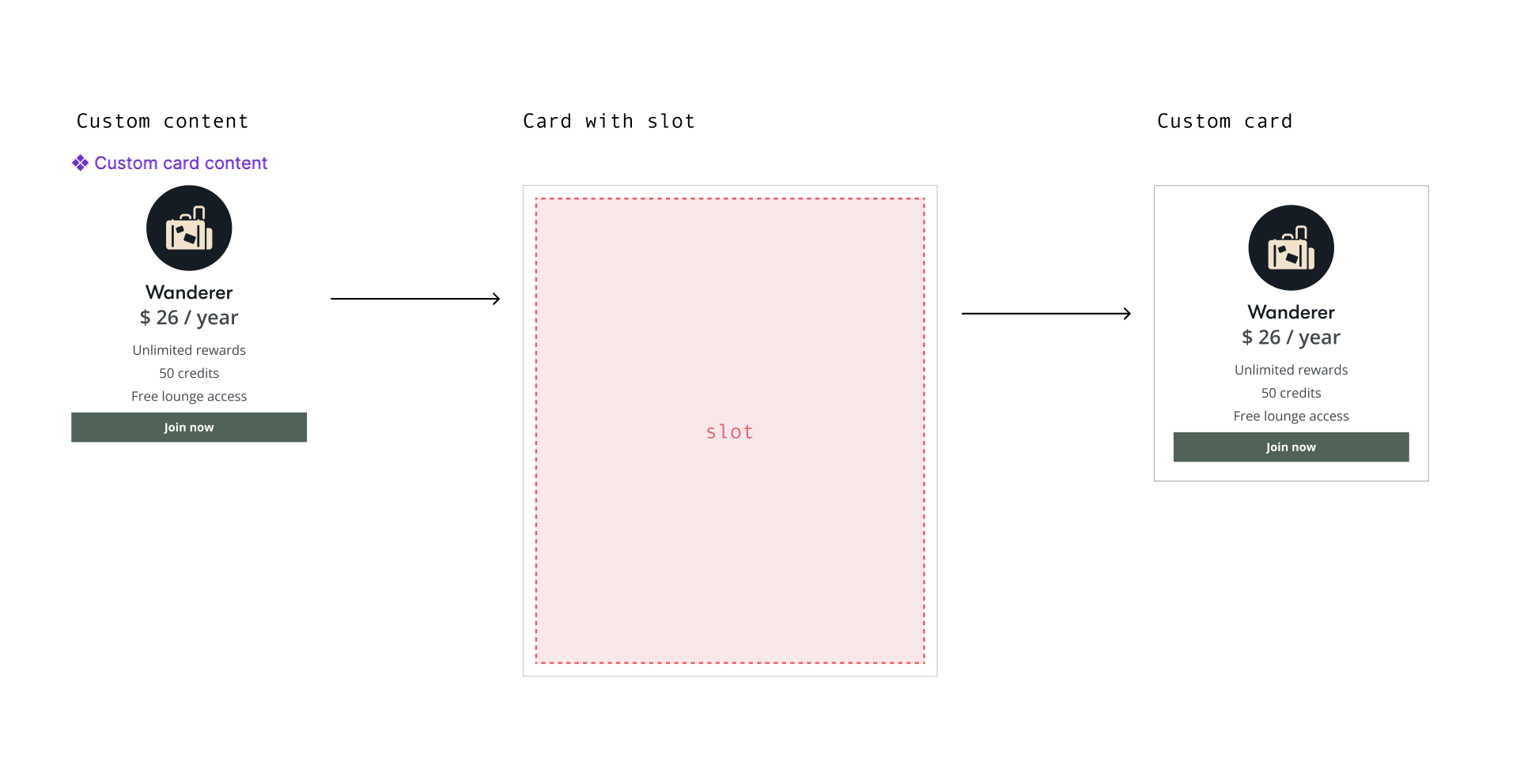
Many components in design systems are containers for other content; that content can range from simple (like an image with text and a button) to more complicated UI patterns like forms. With slots, the system now requires only four card components, dramatically reducing the previous large number of variations.
Example of slot component structure using a card component.
Using the Figma instance panel, designers can insert content into slots from either the Atlas library or their own local libraries.
These cards are fully dynamic with auto-layout capabilities, allowing them to accommodate any content while automatically adjusting their width and height as needed.
Providing the basics
While we encouraged designers to create content, many common patterns still exist. By providing basic content building blocks, Atlas allows designers to compose different card variants while maintaining consistency across products.
These basic building blocks provide designers with both a baseline pattern for slots and atomic components they can combine. This approach reduces the load on the Figma design system library by eliminating the need to store every possible combination that designers might request.
Using the instance panel, designers can select predefined patterns or "building blocks" to create standard cards or variations of standard card content.
Conclusion and findings
This feature had many complex parts, but I think the benefit outweighs the efforts to get to this dynamic phase of the design system.
Some of those are:
Getting skakeholders on board
Many stakeholders initially questioned the value of this work since components were already available. We validated the approach through designer testing to gain approval to modernise the library.
Deprecating components
Following the upgrades, older components were gradually phased out and deprecated. The team needed to develop a clear communication plan for design users, explaining how and when they should replace components in their existing files—or if replacement was necessary at all.Educating designers
Many designers needed help understanding Figma and auto-layout. Having grown accustomed to receiving ready-made components from the systems team, they required support learning how to use auto-layout and insert instances into slots.Closer design and development methods
One aim of my work is to have a close relationship with developers and to share architecture patterns between libraries as closely as possible. This work brought engineer thinking into design.Less detaching
The Figma library detachment statistics lowered drastically.Smaller design system library
With the smaller library, component maintenance became more manageable. Having only two designers on the team, we were freed from accommodating numerous design requests, allowing us to focus on more important work.


